THE THEORY OF COLORS
Table of Contents
Understanding Color Theory: Why it’s Important and it’s Fundamentals
Color theory is the science and art and how you can use colors. It’s the way through which you can understand how humans perceive and receive the color, and the visual effects of how the colors are separated and mixed and interact with each other.
Color theory is key to working out drawings and paintings correctly. Therefore, we are going to do a little review of its main concepts. Animaster being the best animation college in Bangalore has always tried to educate students in every manner possible, so we come up with topics that can help a student know about design through its Graphics Course and Graphic Design Classes.
Color theory also describes those colors that respond to humans in which way and the methods to determine for replicating color. We will also be talking about the color wheel in color theory and what is the importance of color.
So, why do you need to understand color and color theory? Imagine launching a new chocolate brand. Just slap the blue color on the packaging material and you are done, right? The blue color helped Cadbury sell Dairy Milk, So just use that color and voila! My chocolate will sell in good numbers.
When we talk about “color theory” we mean a set of rules for mixing colors to achieve the desired effect. But, going a little deeper, we must ask ourselves: What is color?
According to the artist and theorist Josef Albers (188 – 1976) ” Color is one of the most relative concepts in art ” and we could extend this definition to any other aspect of life. Color is a complex sensation that is the result of several physical phenomena that occur simultaneously.
Color theory will help you understand how humans interact with different colors and how you can use colors to your advantage.
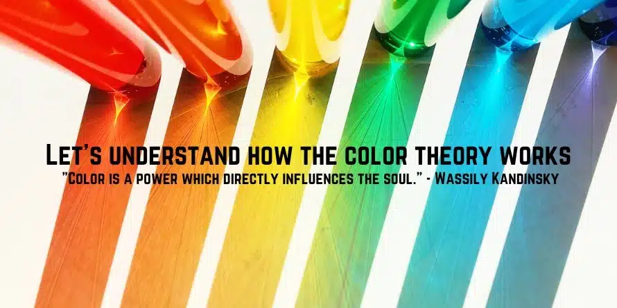
Let’s understand how color theory works:
– “Color is a power which directly influences the soul.” – Wassily Kandinsky
In one word color can be called “perception”. The eyes perceive something and this data is sent to the brain to understand it. Same with the colors, the eyes perceive the colors and then this data is sent into the brain for understanding what color it is.
How do we identify color?
This is how we identify colors. The light gets reflected by objects in different types of combination for wavelengths. Our brain directly picks up on these wavelengths and translates it and recognizes it as that distinct color. That’s how we identify colors.

Imagine you are in the supermarket searching for that favorite soft drink of yours and you either go for the Blue colored familiar bottle or the red-colored bottle. Whether you chose Pepsi or Coca-Cola, you looked for that blue-colored label or that red-colored label from the multiple drinks that were kept there.
People decide based on color
People decide instantly whether they want to buy a product or not instantly. And do you know, that color plays a major role in that decision? So, if you are in branding, you should consider the color as your main priority.
The Color models
Humans perceive colors through the light waves. But how do you define the exact color? So this is where color models come in. Color models help in analyzing the colors using color components and different values. The color models help in the conceptualization, viewing, discussing the color in design, art and in other applications. Basically, the color models help in identifying the exact colors we want for our use.
Types of Color Models
To deeply identify the color models, the color models have been divided into two and both find their applications for different uses and wants. Let’s discuss the color models in depth and find out where they are used:
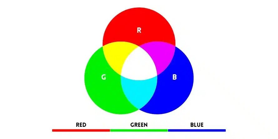
RGB: The model of additive color mixing
Through the additive color mixing model, this provides you with a model of color that can be created by mixing the three major colors: Red, Green and blue, hence RGB through the different intensities using light. It’s a simple way, the more light you can add to the colors, the brighter the mix of colors gets. If you mix all three colors you get white light.
The RGB model is used in electronics like in TV screens or projectors, where they use the RGB or Red, Green and Blue as the base colors and mix them together to produce different colors on the screen or project it.
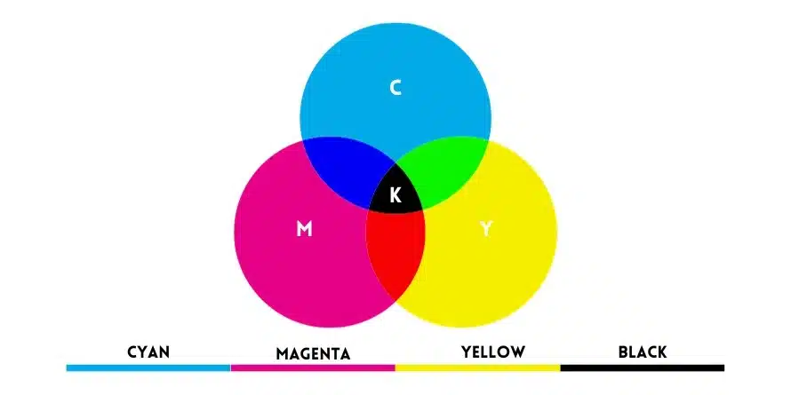
CMYK : The color model of subtraction
Any color we see on the printable materials like the newspapers, magazines, packagings, etc, use the subtractive model of color mixing. This model is commonly called CMYK.
We learned this in kindergarten and school life: This is the color model we were taught from Kindergarten and in early classes in our schools when we used water colors etc.
Before CMYK, the main colors used in the subtractive color model were RYB or Red, Yellow or Blue. These were the primary hues that the painters and others used to make to get all the other colors. As we introduced color printing, the RYB color model was replaced by the CMYK model or the subtractive model.
The main colors of CMYK are Cyan, Magenta, Yellow & Key/Black. This helps the printers to produce even richer and better colors than the older RYB model.
RGB vs CMYK: differences
Let’s look at the differences between RGB and CMYK using a crisp and concise table format:
| RGB | CMYK |
| Uses Primary colors like Red, Green and Blue as base colors for creation of hues. | Uses primary colors like the Cyan, Magenta, Yellow and Key(Black) for the creation of hues. |
| The more you add light, the lighter the shade becomes | Adding more ink will make the color become duller and darker. |
| Used for Digital works like Projectors, Screens, apps, websites, etc. These need proper and accurate format for proper color reproduction. | Used for printing on different formats like posters, paper, business cards,flyers etc. The light is reflected from paper. The quality depends upon the type and quality of ink. |
| RGB has a wide spectrum of colors. Can produce saturated and vibrant colors from 16.7 million colors. | CMYK has a narrower spectrum of colors from 1.07 million colors. |
The Color Wheel
Remember those school days when you were in earlier classes of childhood, and you got that pack of crayons. It opened a whole new world of colorful opportunities for you. Until you lose some colors.
Understanding the concept of color wheel and color harmonies ( how the color communicates to you, what works and what does not work) is actually fun and amazing. It’s really exciting to learn the color wheel.
Basics of Color Wheel
You won’t imagine who invented the color wheel. It was invented by the SIr Isaac Newton in 1666. So, Color wheel has become very old now. Designers and artists still today extensively use the color wheel for color harmony, color mixing and color palettes.
So, what exactly does a color wheel consist of?
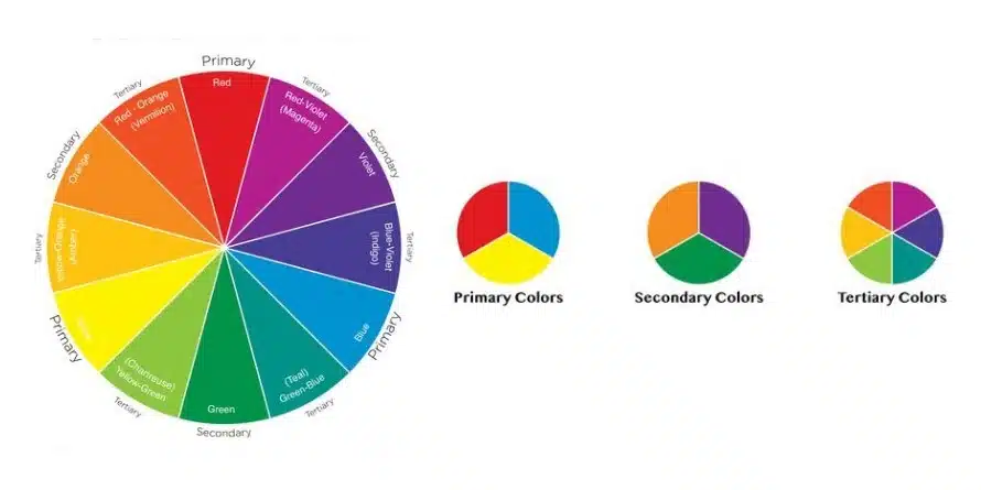
The color wheel has three color areas or patterns.
- Primary Colors: these colors are Yellow, Red and Blue.
- Three Secondary Colors: These colors are formed when the primary colors are mixed with each other.
- Tertiary Colors: There are 6 tertiary colors and they are formed when the secondary and the primary colors are mixed with each other like red-violet or blue-green.
Separating the warm colors and the cool colors
Draw the line from the central part of the wheel and you can easily distinguish the warm colors from the cool colors. The warm colors on the color wheel are in yellows and oranges and reds while the cool colors are in greens, purples and blues.
Shade, hue, tone and tint
Remember the 64 pack of crayons you got later in life when you got into the higher classes after kindergarten. But we heard that the main colors are 12 (that you see in 12 pack of crayons). How did we go from 12 to 64. This is where you will understand the importance of shades, hues, tints and tones.
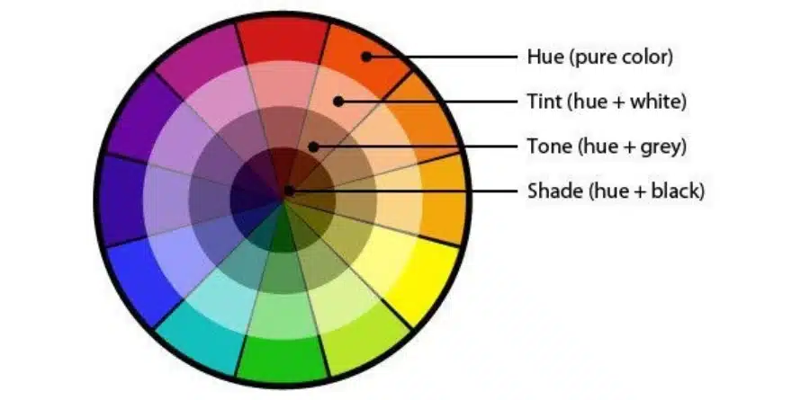
So, what are tints, tones and shades? Simply put, the tints, tones and shades are variations of different colors and hues and it’s based on the color wheel. Let’s look a these one by one:
Tint: The tint is the colors or hue where you add more white and make the color lighter. Eg: Adding white to red will produce Pink.
Shades: A shade is a hue when you add more black color to it and it becomes darker and darker. Eg: Adding Black to Red will produce Burgundy.
Color Schemes
Let’s talk about schemes.

Ok! Not about this scheme but Color Schemes
So, what is a Color Scheme and why does it matter?
With the use of color wheel developers have created color schemes for the different marketing materials.
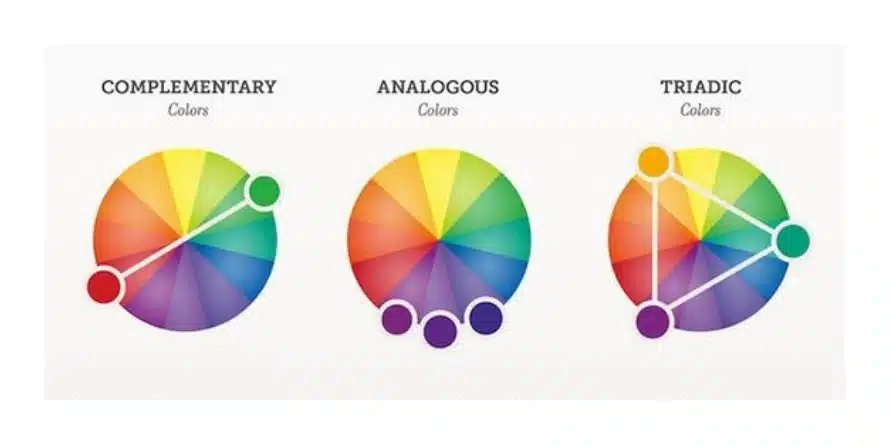
Complementary colors :
Complementary Colors are the most important in the color wheel – For example green & red.
As there is a very sharp contrast between the two colors, they can help to make the different image really pop, but if you overuse them it can get difficult and tiresome.

Analogous Colors
The concept of analogous colors just sits beside each other on the color wheel. For example, yellow, red and orange sit beside each other on the color wheel. In businesses these can be an eye sore sometimes but these can help you to instruct the customers towards them to take a certain action .

The New MasterCard Logo uses Analogous Colors. Want to go shopping right now with your card?
Triadic colors

The Firefox Logo uses the Triadic Color Scheme well
The triadic colors are spaced very evenly in the color wheel and have a bright and dynamic trend to it. Using this type of color scheme can provide a look of harmony while contrasting nature as well. This can lead to every element of that item stand out while helping it to make the whole image pop.
Why is Color Theory important?
Ever heard these terms, Branding, Marketing plus Sales. Everyone has rights! Therefore, these 3 elements depend upon the color scheme. The Color scheme helps to evoke emotions in the customers and help them to take action. Maybe I will buy a Burger from Burger King now just because of the food color scheme.
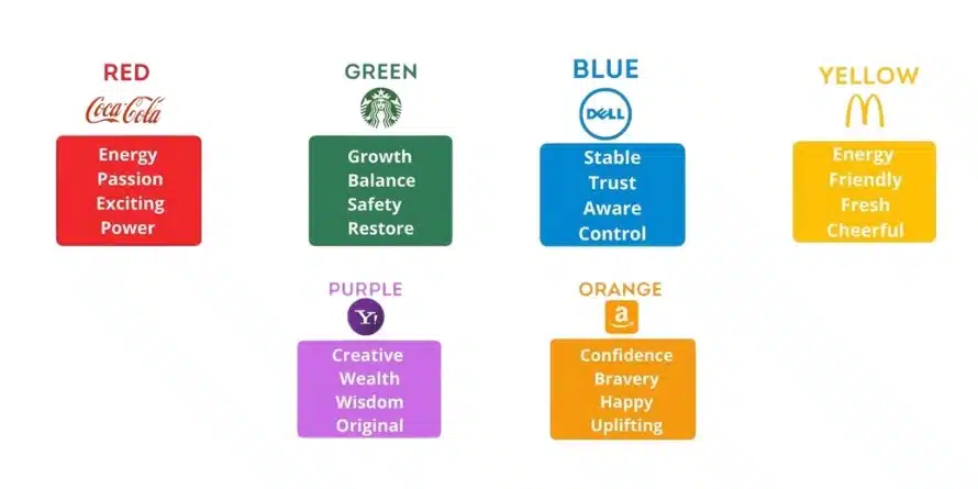
Different colors evoke different emotions, right? Check this for total understanding
At one of the best Animation schools in Bangalore, Animaster has designed the course of Color Theory to help you understand the deeper concepts of it and help you at a professional and academic level to achieve mastery through a BSC Animation and VFX Degree course or a Graphic design course in Bangalore.
Color Theory plays a major role in our lives and with Animaster you will learn this aspect as well.
Technically, when the light emitted by a light source (such as the sun or a light bulb) reaches a surface, matter absorbs part of the wavelengths of the light spectrum and bounces others. The bouncing lengths are what add color to things. This bounced light reaches our eye, stimulating our cones and causing our brain to interpret color.
Light colors and pigment colors
In our eye, we have three types of cones that determine the so-called primary colors of light. They are red, green, and blue (RGB model). The combination of all these colors gives us the complete chromatic range and, if we mix them all three, the result is white and the absence of all three generates black.
In painting, however, we work with a different model. We would call them to pigment colors and they interact differently from light colors. The primary pigment colors are yellow, cyan, and magenta (CMYK model). The mixture of the three generates us black.
BVA in Animation and Game Art is one of the best animation programs in this era that serves the main purpose of educating in smart ways to the students and they can learn these concepts of Color theory in detail.
The primary colors in painting (Cyan, magenta, and yellow) are what we need to generate, from them, the rest of the colors. When we mix two primaries in equal parts, we generate secondary colors. When we mix a primary and a secondary in equal parts, we obtain a tertiary color. With the rest of the combinations, you can get infinite mixes.
Colour
Color is one of the most important elements in design. In addition, it is among the first choices made when you decide to reform homes. The design of a room can revolve around a specific color or palette.
Colors have an important emotional influence. You have to know how to choose the right one depending on the room to be decorated. For example, in the bedroom, you have to promote rest. For this, you can use blue, yellow, or green in its lighter shades. In the dining room, you can use tones that favor the appetite, such as citrus. They also influence the perception of space. Light colors give the feeling of larger rooms, while dark colors reduce it.
Design schools organize classes that can give students an overview of color theory. In an Animation University you can learn color theory.
The colors and the chromatic circle
Before continuing, let’s stop for a second to analyze the characteristics of the colors that surround us. We can assign three basic attributes to each color.
- The hue: It determines whether it is one color or another, that is, we say that it has a green hue, an orange hue, a yellow hue …
- The luminosity: When we talk about this concept we refer to the lightness or darkness of the color. That is, the light intensity. The dark colors bend towards the black and the light ones towards the white. We usually refer to it when we speak of “it’s a dark green” or “it’s a light blue.”
- Saturation: This is purity of a color. That is, the amount of gray that color contains. The higher the percentage of gray, the lower the saturation and vice versa.
Now that we know the properties of color, we are going to delve into a new concept, the chromatic circle. This circle is a very clear graphical representation of different color palettes. You must bear in mind that this chromatic circle takes as reference the pigment colors that we indicated above. In it, we see the hue reflected through the primary colors Yellow, cyan (blue), and magenta (Red), the secondary and tertiary colors. In turn, saturation and luminosity are represented.
On the color wheel, complementary colors are placed in pairs, opposite each other. These pairs of colors are the ones that provide the greatest contrast and will have the greatest aesthetic harmony. Design schools teach color theory through theoretical and practical experience to the students so that they can understand the theory well.
Let’s start with the basics. Do you remember when you learned about primary and secondary colors in design school? Well, you already know something about color theory. The primaries are blue, red, and yellow; the secondary ones, orange, green, and purple.
The mixture of red and yellow creates orange; that of yellow and blue, green; or the one with blue and red, purple.
If we mix these colors, we get even more shades, such as orange-red and lime green.
Together, all the colors that we talked about earlier make up the chromatic circle or color wheel.
These words may not be familiar to you, but they are key to understanding how color nuances work.
- Tonality: it is the easiest of all. Basically, it is synonymous with color.
- Saturation: refers to the intensity, that is, if the color is more subtle or stronger.
- Brightness: tells you if the color is dark or light, in a range from black to white. This gives you lots of options, for example, you can go from a deep dull reddish to pastel pink.
Ways to combine colors
Now the question is how to mix all of this together to create professional-looking color palettes.
There are formulas that can help you, based on something called color harmony, and all you need to do is use the color wheel.
Don’t be afraid to play with the palette and create your own interpretation. That is the purpose of these formulas: to give you a starting point with which you can guide and inspire.
The simplest formula is monochrome because only one color is used.
Pick a point on the circle and use your knowledge of saturation and brightness to create variations in hue. The best thing about this type of palette is that you have the guarantee that they will combine.
The analogous formula chooses the colors that follow each other on the wheel, such as red and orange, or blue and green.
Complementary colors are opposite each other on the wheel. For example blue and orange, or the classic red and green. To avoid making the palette too simple, you can add lighter, darker, or low-saturation tones.
With split complementary colors, you use the colors that are next to the complementary color. This gives you the same level of contrast, but more options for shades, and possibly more interesting results.
On the other hand, with the triad, a triangle is formed in the chromatic circle and the colors that are in each corner are used. These combinations tend to be quite striking, particularly with primary and secondary colors, so think carefully before choosing them.
A tetrahedral palette forms a rectangle on the circle, so it uses not one, but two pairs of complementary colors. This formula works best if you leave one color as dominant and the other three as auxiliaries.
This theory can help you on different occasions, such as choosing shades for a design or perfectly mixing what you are going to wear. By learning a little about it, you will begin to see color in a different way.
Since you know how color theory works, you can start using it in all the designs you make.
Share This Story, Choose Your Platform!
Learn Color theory with Animaster
With one of the highly prestigious Animation college in India learn the color sciences as Animaster provides Graphic Design Course in Bangalore attend Graphic design classes and become a true professional in it.
Also, if you want to pursue Animation and want to become a professional animator with an animation degree. Whether you want to pursue Bsc Animation and VFX Degree or you want to do courses like Bsc visual communication or BA Visual Communication or Bsc Viscom, Animaster has all courses accredited by Government Animation College. So, from color science to Animation, make your dream come true of doing something related to colors or pursue an Animation course, we at Animaster have everything to achieve success from your passion.
With one of the highly prestigious Animation college in India learn the color sciences as Animaster provides Graphic Design Course in Bangalore attend Graphic design classes and become a true professional in it.
Read more: Advance Your Career with the Most Up-to-Date Graphic Design Course in Bangalore